Related Articles

Previously I wrote about the changing nature of the sports trading industry and how members must develop their skillsets to keep pace (The Evolution of Sports Trading within European Bookmakers). One way I have adapted is by learning to perform data analysis in R.
We all use statistics daily and I know that many network members are already proficient R users. However, I am equally sure there are many like me for whom analysis work has always been confined to Microsoft Excel. It is Excel that we feel most comfortable using and the prospect of moving to a platform like R can seem daunting.
There are many advantages to using R over Excel for analysis and modelling and I hope to demonstrate some of them here. Benefits include speed, scale, and graphical capabilities plus scripting your work means it can be easily and quickly reproduced in the future (by yourself or by others). Employers in many industries are increasingly seeking candidates with R skills ahead of more traditional Excel users.
If you are comfortable using reasonably complex formulae in Excel, the transition to R might not be as painful as you may think. If you do encounter difficulties, R comes with access to a vast support network and a range of free downloadable packages meaning much of the intimidating heavy code writing is often already done for you. This includes specific sports modelling packages based on well-known football ratings models by Dixon and Coles (1997) and Karlis and Ntzoufras.
There are many free online courses available; I chose to focus on statistics courses with accompanying R demonstrations (avoiding any with too heavy a programming emphasis). A great introduction to R with sporting examples is here and Coursera has an excellent general Statistics course.
I am currently studying Statistical Learning and I hope to be able to cover some of these more sophisticated techniques in future articles. For now I want to demonstrate the capabilities of R in comparison to Excel and to do this I will look at the relationship between distances travelled and home advantage in English football.
Why Distance and Home Advantage?
The concept of home advantage remains an intriguing and misunderstood phenomenon. Many explanations for why it persists have been put forward and one of these is the impact of the distance travelled by the away team. This issue received publicity recently due to the heavy fixture demands of the festive period.
Dataset
The dataset contains 5 full seasons of English football results from www.football-data.co.uk (10,180 matches from Premier League to League Two). To isolate home advantage the results were paired for every combination of teams within each season resulting in 5,090 rows of data. A sample of the data can be seen below:
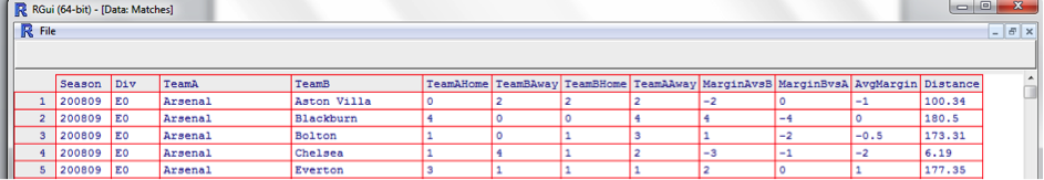
Example: In 2008/09 Arsenal defeated Blackburn 4-0 at home and also won 4-0 away. Home advantage (AvgMargin) is always considered from the home teams perspective so for this pairing the result is ((+4-4)/2) =0. Against Everton, Arsenal won by a score of 3-1 at home and drew 1-1 away. For this pairing the AvgMargin is +1.
The results are paired in this manner to remove the effect of different ability levels between teams. For example it would not be fair to treat a match between Carlisle and Arsenal the same as a match between Carlisle and Barnet. Similarly, results are only paired within single seasons to remove any effect of fluctuating team ability levels; a trip from Carlisle to Portsmouth in 2008/09 would be very different to the same trip in 2012/13.
With contribution from Professor Wayne Winston distances were then calculated between each club pairing. The distances are all recorded in miles and are straight-line distances (‘as the crow flies’).
Both the data (csv format) and the R script of the analysis (txt format) are available to download from the links below:
Inspecting the Data
The next step is to examine the data in more detail (e.g. check distributions and means, check for outliers etc.).
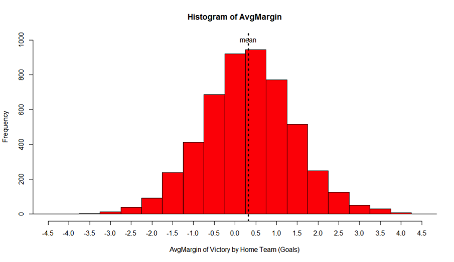
A single line of code produces a histogram (fig.1) of the AvgMargin variable:
> hist(AvgMargin, col = “red”, breaks = 20)
(*note that the syntax of this code is very similar to an Excel formula)
Fig.1
(*The same function in Excel is much more time consuming [http://www.youtube.com/watch?v=RyxPp22x9PU])
The most frequently observed values for AvgMargin are zero and +0.50 goals to the home team. The mean value is +0.33 goals to the home team.
A single line can also be used to view summary statistics for the Distance variable:
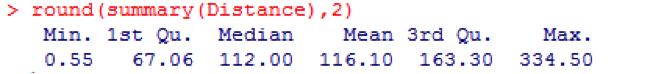
(* to achieve the above in Excel would take several separate formulae)
Distance ranges from 0 to 335 miles with a mean of 116 miles and a median value of 112.
Is There Evidence of a Relationship Between Distance and Home Advantage?
Initially, the Distance variable was split into two groups: those with a value below the median (112 miles) and those with a value above the median (see Fig.1). A tapply function was then applied to return the mean AvgMargin for each group:
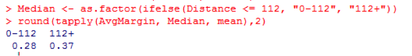
(* in Excel this would have to be done with Pivot Tables or Sumif and Countif formulae)
For all pairings with a Distance between 0 and 112 miles AvgMargin is +0.28 goals to the home team. For all pairings with a Distance of above 112 miles the AvgMargin is +0.37 goals. This may not seem a large difference but in betting terms this could well be the deciding factor between placing a bet and not placing a bet.
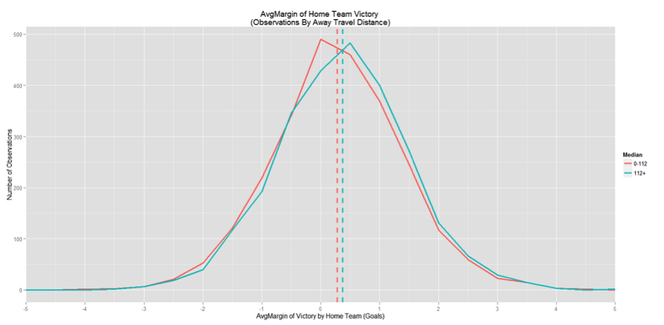
To visualise this difference, and also to demonstrate the graphical capabilities of R, a frequency polygon was produced (Fig.2):
>ggplot(Matches, aes(AvgMargin, colour=Median)) + geom_freqpoly()
Fig.2
(* the equivalent in Excel would take many more steps to produce)
The two solid lines on Fig.2 represent the number of observations of each possible AvgMargin split by whether the travel distance was above (blue line) or below (red line) the median of 112 miles. The vertical dotted lines represent the respective means of the two groups (+0.28 and +0.37). We see for over 112 miles a slightly higher mean and slightly more observations favouring the home team (i.e. the blue line is above the red line for every value to the right of zero). The opposite is true for each AvgMargin to the left of zero.
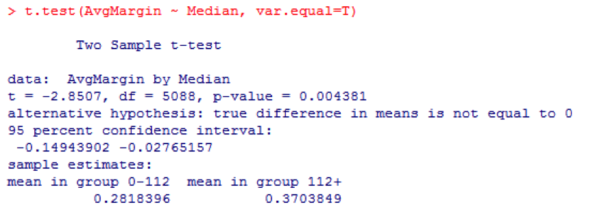
A small relationship can be observed between Distance and AvgMargin. However, this could be due to chance or sampling error. A way to test for statistical significance is to run a t-test:
(* The same process would take longer in Excel [http://www.youtube.com/watch?v=norKDF0MH0M])
The value to note here is P-value = 0.00438. This number represents the chance of observing such a difference (between 0.28 and 0.37) from this particular dataset if no relationship actually existed (i.e. if there was no actual relationship between Distance and AvgMargin in our dataset there would only be a 0.4% chance of seeing the variance we have observed).
Once an effect is observed, it is also important to have a way of estimating the size of that effect. For this R uses a function called Cohen’s D:

(* Again the same process in Excel is slower [http://www.youtube.com/watch?v=OBQIKIcrAGI])
A Cohen’s D score such as 0.079 is evidence of a very small effect. The relationship observed is significant (it is unlikely to have been observed by chance) but it doesn’t seem to have a very large effect on the outcome variable AvgMargin (i.e. it is just one of many explanatory variables at work).
Plotting a Linear Model
Splitting data by median can be problematic. A simple linear regression model was therefore also created to include the full Distance variable.
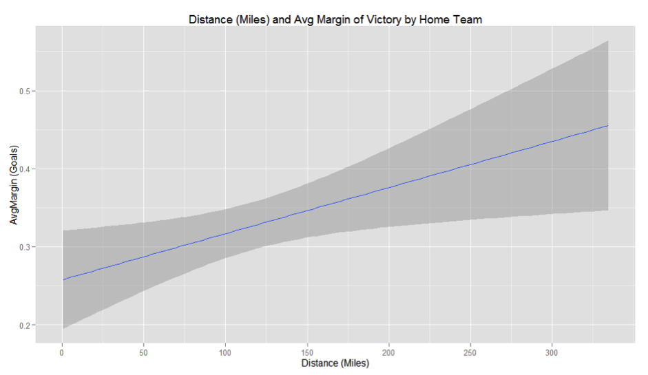
The graphical power of R is further demonstrated below:
>ggplot(Matches, aes(x=Distance, y=AvgMargin)) + geom_smooth(method=”lm”)
Fig.3
(*This is a much slower process in Excel [http://www.youtube.com/watch?v=aSOUQKqIYak])
The upward sloping blue regression line on the graph shows that as Distance increases (x axis) so too does AvgMargin for the home side (y axis). The dark grey shaded area represents the 95% confidence interval around this regression line.
The full details of the linear model can also be viewed as below:
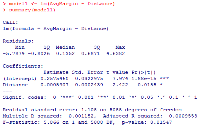
Intercept (+0.257) represents the home advantage our model would expect for a match pairing where the distance travelled was zero (we can also see this on Fig.3). Below this is a figure of +0.00059, which is the regression co-efficient. This implies that for every +1 mile increase in distance travelled the AvgMargin of the home team would increase by 0.00059 of a goal. This figure has a p-value of 0.015 which suggests that this relationship is significant (i.e. it is unlikely we have observed it by chance).
Another figure to note is the multiple R-squared value of 0.001152. This represents the proportion of the variance in AvgMargin which is being explained by the variance in Distance. This means that only approximately 1% of home advantage is being explained by distance travelled. We might view this graphically with the full scale scatterplot below:
Fig.4
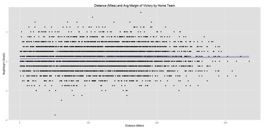
This shows the full spread of results between distance and AvgMargin. The regression line of our linear model is very shallow and the results observed show a wide variance around it. Therefore the model has a long way to go to fully predict what might happen in a football match.
Conclusions and Further Work
The analysis above has demonstrated that there is evidence of a relationship between distances travelled and home advantage although it is only a relationship with a very small effect size – it is just one of many different variables that affect the result of a football match. That being said, in betting it is often these small margins that can be the difference between winning and losing, so it may still be worth incorporating distance alongside these other variables in a more sophisticated predictive model.
Several ideas for further analysis also present themselves. There may be limitations to margin of victory as a variable so one idea might be to try to use match result (win-draw-lose) instead. Also there may be other factors influencing the effect of travel distance. For example, is the effect different in different divisions? It there a seasonal effect? Is the effect different for matches played at the weekend versus matches played midweek?
Final Comments
Thank you for reading and I hope I have gone some way to proving that R doesn’t have to be as daunting at it may first seem. I also hope I have demonstrated some of the immediate benefits that can be gained by switching to R from Excel. For those who are already using R, please feel free to download the data for your own work. I am also keen to receive suggestions for improvements to the above – it is collaboration like this that Sports Trading Network was created for after all.